Asperitas
How might we create new narrative and gameplay elements within an AR medium to add to an existing world and non-AR focused IP?
Project Details
Asperitas was a spinoff mobile AR game as part of the Sky Haven IP for Hololabs, an industry client for the Centre for Digital Media's DMED521: Projects 3 course. They are an immersive experiences agency that's focused on building virtual reality (VR), augmented reality (AR), and theme park experiences.
Timeline
May — Aug 2022
13 weeks
Role Summary — UX + UI Designer
Responsible for crafting the visual and narrative direction of Asperitas’ UI. Created high fidelity in-game HUD elements, menus, and various assets (icons, buttons).
Team
1 Project Manager / UI Artist
1 Product Manager
1 Concept Artist
1 UX + UI Designer (Me)
2 3D Artist
2 Developers
About the Game
Mysterious creatures have shared our world, hidden from us for longer than we know. They have revealed themselves only to a selective few at turning points of our history when our planet or species was under threat. An organization was formed to protect these creatures and their secrets from the public, but now, at the brink of disastrous climate change, these creatures have revealed themselves to us, and the agency needs to increase the efforts to help them.
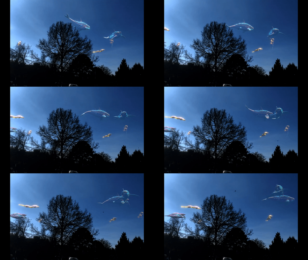
Asperitas is an AR mobile game for casual gamers who like to explore and create. The player is a researcher with the mission to increase the population of amazing creatures. Their goal is to explore their surroundings, collecting items needed to create environments that allow the creatures to thrive. Additionally, nurture the creatures through multiple interactions until they are ready to be released.
Key Responsibilities
In Asperitas, I hopped on Week 3 of the project to begin work as a UX + UI Designer:
Spearheaded creative direction for the UI
Facilitated co-design workshops with UI artist and product lead to align on visual and narrative direction for the UI based on Hololabs’ Sky Haven IP
Executed review sessions of various UI elements (e.g. icons) with UI artist to ensure coherence of UI in regards to pre-established direction
Created various UI elements implemented within the game
Initial ideation and concept sketches for HUD layouts and concepts for the UI and icons
Wireframes to illustrate the overall layout for the UI
Interactive prototypes to showcase the overall UI flow for the player
Turned medium fidelity black-and-white components into high fidelity by incorporating brand colors in accordance with pre-established direction
Established design system on Figma using the components and variants feature
Fleshed out multiple icon and layout states, all readily modular on Figma for handoff to HoloLabs
Consistently collaborated with the team to understand the visualization of core mechanics as UI
Communicated with the Product Manager to identify core mechanics of Asperitas to understand persistent elements and key tasks required for players
Expanding on an IP with our own unique flavor
Hololabs already had an established IP in the form of a non-AR mobile game. However, they asked us to expand on this world, adding an immersive experience angle to it. Based on this challenge, we needed to…
Intertwine Sky Haven narrative elements into our AR game
Carry over branding and visual elements from Sky Haven and modify them to fit into Asperitas
Maintain the brand identity while also adding onto an already rich world
Highlights
Hopping mid-way into an established team and project
I only hopped on the team at Week 4 of a 13 week semester after prolonged discussions with the team on my responsibilities on the team. Ultimately, we decided that I should fill the gap of a UX and UI Designer on the team.
Coming into a project midway through, I understood that Hololabs had already introduced the Sky Haven IP to the team. It had its own narrative built into the world they were expanding upon as well as ideas at various stages of development, one of which is a mobile game already in beta. Hololabs wanted the team to explore and prototype into the AR gaming space. This prototype should add onto the existing merge game as well as the existing world built around Sky Haven.
When I entered the team, the team had already established an intended experience and sub loop which they were going to focus on for the eventual prototype. They also had created a simple premise of Asperitas where you were a researcher who was a part of the Sky Haven world, and your job is to preserve the existence of magical creatures around the world.
The team had already establish a main loop of Craft -> Interact -> Explore, with the focus of the prototype being on the Interact sub loop
To spark curiosity in people of all ages through an innovative and entertaining gaming experience that provides a sense of wonder and reward to our players.
In addition, the team had also decided on an intended experience of the game which added to additional constraints of what I had to work with,
To overcome this challenge of getting on the team late, I needed to:
Quickly understand the intended experience of the game from each team member’s perspective to identify what the team wanted to achieve through this prototype
Familiarize myself with the mechanics they had already established as part of the sub loop to pinpoint the gameplay elements in the game and what is required from the UI
Flesh out and dive deeper into the Sky Haven world to analyze the visual direction and identity of the world and any existing designs, allowing me to drive the prototype’s visual design as well
Ideation workshops I attended with the team to get up-to-speed with the mechanics they were ideating upon. I was a part of the ideating team for the Build aspect of the core loop
As a result of attending these ideation workshops, I contributed to the game design of various mechanics based on my past experiences with mobile AR games. By noting down crucial AR aspects such as ergonomics and comfort, combining these with a human-centered thinking for game design allowed me to support the Build (creative construction) aspect of the core loop. Some of the key points we established as a result of this workshop for the Build aspect was,
As Building is key to enabling an AR-centric playstyle, players must be motivated to move around their physical space to build a home base that’s personally important and relevant towards themselves and the creatures
Building needs to contribute mechanically to the overall goal of the game that display a sense of progression to give players a goal to aim towards
Building must be designed to be as easy and low frustration as possible to avoid enacting an unnecessarily high interaction cost that already comes with AR games
With the requirements list above, we ideated and expanded upon the details of how the Build aspect would work as part of the core loop:
Buildable objects are made up of three types of categories that can be stacked on top of one another in this order - foundation, stackable, non-stackables.
Buildable objects serve to be either functional or decorative. Functional objects contribute to the overall progression of the game by boosting the relationship with the player’s creatures which unlocks newer stages of progression. Decorative objects helps to increase the emotional attachment of players with the world they built.
Players have the option of toggling between free-form placement or a grid-based movement depending on their building needs
Through my participation in the ideation workshop and overall consultation on the pre-established core loops, the team accurately fleshed out a core loop that had a concretely design which they could move forward into prototyping with.
First prototype our developers created to simulate how the Build aspect I was a huge part of ideating would work with the three different types of objects - foundations, stackables, non-stackables
Concept art created as a result of our ideation to depict functional (left) and decorative (right) objects
Analyzing an IP’s brand identity to create a new direction
After getting to familiarize myself with the progress the team had made so far, I needed to dive deeper into the existing design and art direction that Hololabs had created for the Sky Haven world. This was required as if our game needed to be a part of Sky Haven, our visual identity and purpose of the UI had to match what already existed. To achieve this, we needed to:
Conduct an analysis on existing designs and narrative delivery Hololabs’ mobile game in beta
Explore potential visual direction and elements we could utilize based on said analysis of Sky Haven
Converge and expand our ideas to come up with concrete ideas and examples
My analysis of the visual direction for Hololabs’ mobile game in beta. This helped us in determining how to carry over elements noted here into our new game.
Based on the analysis above, we had a solid idea of the UI design philosophy behind Sky Haven’s world. However, we still weren’t entirely sure how we could adapt these principles and build on them to fit within our new game. According to what we found from this analysis, we understood that…
Sky Haven aimed to convey a Solarpunk theme through their UI’s look and feel, which includes—mixing bright and natural colors, utilizing warm tones, combining soft and hard corner edges. Solarpunk is a mixture between nature and the future, a beautiful utopia if humanity successfully solved challenges in the realm of nature and sustainability.
What’s next was to explore potential visual direction and elements we could utilize based on said analysis of Sky Haven. I worked with Armaghan, our UI artist to collect mood boards and references that could serve as inspiration for our new UI design!
Solarpunk mood boards we collected to get a better idea of how these themes are depicted in media. A major inspiration include Studio Ghibli worlds which typically take place in a Solarpunk world (e.g. Howl’s Moving Castle)
Beyond just color schemes for our game, we needed to understand how Futuristic UI (FUI) could be incorporate in conjunction with Solarpunk colors. We dove into various sci-fi components to understand how they were created.
Upon compiling all the references we required, we needed to converge on a concrete visual direction to start ideating on how the UI should look and feel. I decided to run a Convergence Workshop with Armaghan, our UI artist, and Thelma, our product lead to converge on a concrete visual direction for Asperitas. To facilitate this workshop, we needed to pull whatever we knew about Sky Haven, Hololabs’ mobile game, and Asperitas. We also had to break the visual design down into multiple areas to identify what the overall look and feel of the UI should be like.
The look and feel of Asperitas’ UI should include:
Solarpunk elements—The Sky Haven world takes place in a Solarpunk era, hence the UI should convey the feelings of warmth, welcoming, futurism, and hopefulness
Narrative elements—As Asperitas is an AR game, it is crucial that the UI is diagetic and part of the game world to immerse players
Accessibility elements—Asperitas aims to target a wide user group. As such, the UI should be accessibility friendly to accommodate for all forms of disabilities.
These four areas I established that covers the 3 elements above are:
Primary and secondary colors
Typography
Iconography
Components (e.g. buttons)
As a result of this design workshop, we came up with a UI visual brief below which would guide our decisions when designing UI assets. It also ensured that Armaghan and I remained consistent throughout the design process.
Time lapse of the workshop—me, Armaghan (UI Artist), and Thelma (Product Lead) sat in a room for 3 hours to establish the look and feel of Asperitas
Final visual brief for Asperitas’ UI that guided our decisions throughout the design process and ensured we remained consistent when collaborating to create assets
Exploring and creating a flow and UI based on gameplay and narrative
So, now we had a visual brief we could refer to… We faced the next problem—what UI elements are crucial towards progressing the game? What was important to be persistently displayed on screen? What was okay being hidden in the menus? Our UI is heavily based on the fact that the player is a researcher who owns a futuristic PDA that allows them to monitor elements of their biome which houses magical creatures. How can we balance the narrative aspect while ensuring usability?
Considering that we are building an AR game, while immersion is crucial towards allowing players to find a connection between the real and AR world, we also needed to reduce clutter on the screen to maximize immersion. However, we also needed to discover which gameplay elements were necessary to communicate crucial information on screen that depicted their progress.
After consulting with the team, we identified that the most crucial elements to the players in understanding their progress were the…
Creature Closeness Meter
Biome Habitability Meter
These two meters are extremely important as progression in Asperitas heavily involves around either building out your biome and interacting (feed/play) with your creatures, both of which are quantified and visualized using a progress bar. Once players reach a certain value in the progress bar, they have the ability to evolve their creatures. This loop repeats till the creature reaches the fully-matured stage, which is when they’re able to release the creature into the wild. This is also where the scope of the MVP ends.
However, if we only had two persistent UI elements, how do we access the rest of the menus? The other menus are crucial towards gameplay and aid in player progression. These menus included:
Inventories containing different buildable object types (foundations, stackables, non-stackables, creature-related machinery)
Inventories containing creature-related objects (food)
Missions that enable creature growth and evolution
To solve this issue, we decided to group these non-persistent elements into a button to ensure minimalism and reduce on clutter. This meant that players can easily access these menus using a tap of a button. It also allowed for an ergonomic thumb-zone design that assists players in accessibility, an aspect that’s especially important in AR.
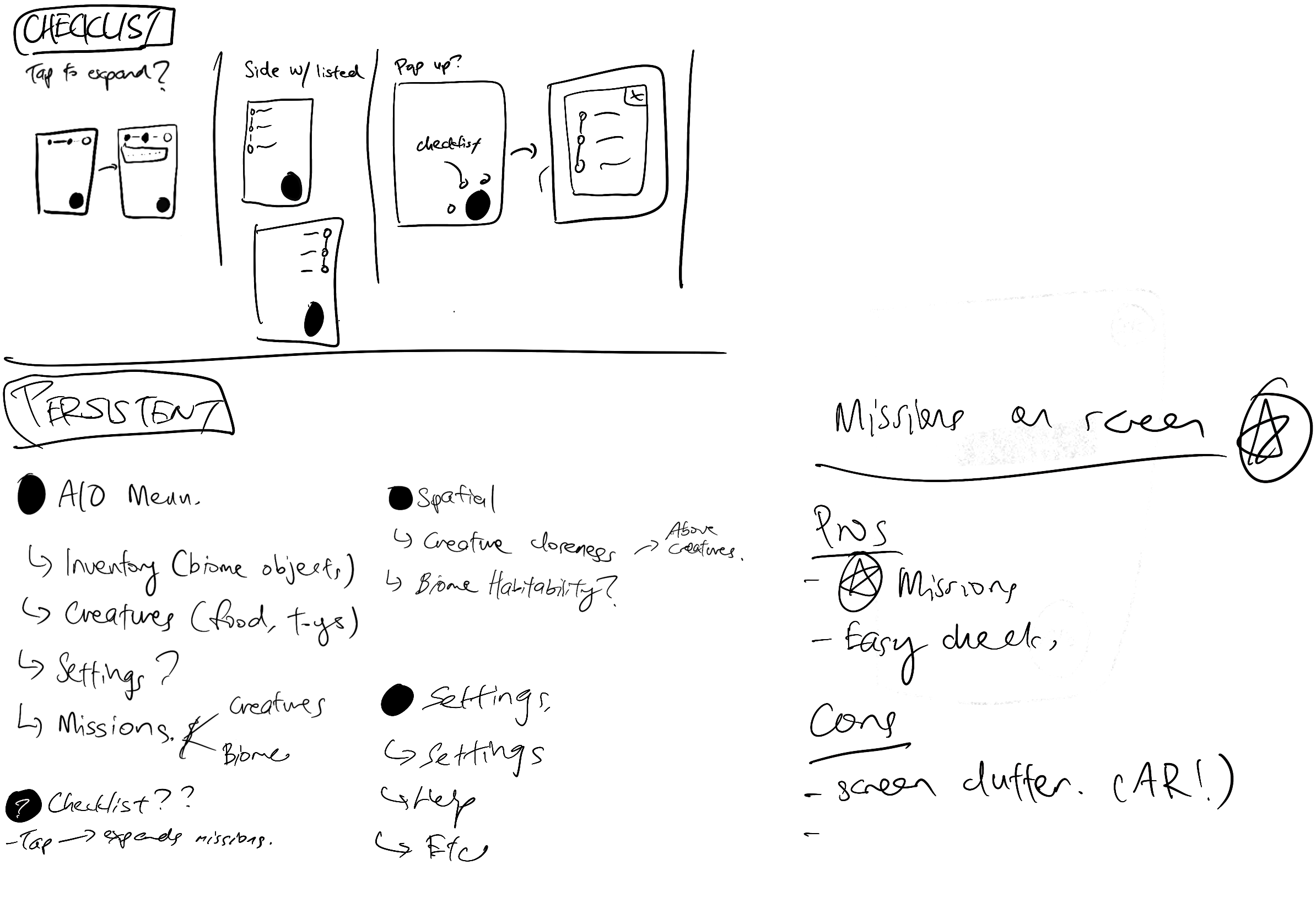
To fully visualize this, I mapped out every interaction and mechanic that could be stored in our UI and created an information architecture to understand how to organize and layout our UI. I also ideated on possible layouts of how these items could look like on a phone screen.
Information architecture of how different menus in Asperitas are organized. We needed to split the UI elements into Persistent and Non-Persistent due to immersion and accessibility aspects of AR
Sketches to explore various layouts of how different menus would be laid out in conjunction with persistent UI elements. I also explored non-menu interactions such as the placing feature located in the Building aspect
Based on the information architecture and sketches, I proceeded to begin creating lo-fi wireframes to better communicate how I envisioned the individual UI elements would be placed on a screen. While designing the wireframes, I wanted to remind myself that I was designing for an AR game, hence why the background remains a real-life place located at the Centre for Digital Media. I needed to ensure that all the elements I created followed proper accessibility and AR usability practices (e.g. Thumb Zones).
Wireframes I created to explore various layout options of how the menus would look like in game. I explored layouts for Persistent Elements, All-in-One Button, Inventories, Missions, and components for Objects
Tying the wireframes together to create a lo-fi prototype gave the team a good idea of how interactions and flows worked within Asperitas
Collaborating and exploring various versions of iconography with Armaghan (UI Artist). Icons in Asperitas aim to stick to conventions while also incorporating as much narrative elements in their design
High fidelity mockups for Asperitas
Establishing a design system and pipeline for handoff
Approaching the end of development, we needed to establish a pipeline on how to handoff UI assets to the developers. The issue we faced here was the fact that we had multiple states for UI assets, and our developers weren’t entirely familiar with Figma. The key question became…
How can we organize and independently handoff UI assets to our developers who aren’t familiar with Figma’s exporting system?
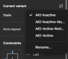
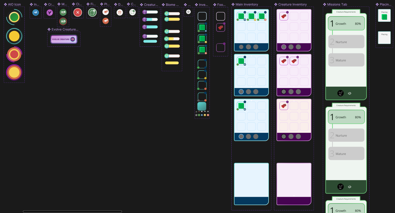
To resolve this, I decided to establish early on when we began creating assets on Figma that our design system should utilize Figma’s robust component state system. Our design system should also contain naming conventions which correspond to the object categories listed above, following this format CATEGORY-FEATURE-STATE-MISC.
Establishing proper naming conventions and components in Figma allowed our developers to easily export and implement UI assets from Figma to Unity
Reflecting on a hectic mid-project onboarding…
Getting back to my roots (but with new tricks!)
It had been a long period of time since I’ve gone back to designing comprehensive UIs for a while. However, knowing what I know now, I came back utilizing a lot more different techniques than I had before when designing for traditional apps… I returned with further knowledge of how UI is implemented and how assets are handled, and this allowed me to easily communicate with the developers during handoff. I realized how important getting to speak the same language as your teammates were!
Exploring implementing UI on my own
Considering I’ve been mainly working on Unreal Engine, I haven’t had the opportunity to work too much on Unity. I wish I had more time to explore Unity UI and how assets are implemented. Nevertheless, more time to explore in the future.
More user research
As I was juggling other projects, I hadn’t had the time to conduct as much user research as I thought. In fact, I wasn’t involved in any playtests or research in this project. I’d love to get more experience in the future testing game UI’s and understanding how different it is compared to traditional usability tests.


